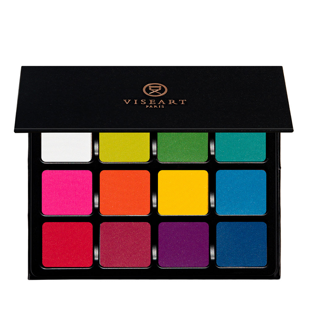
VisePRO Editorial Brights Matte Eyeshadow Palette
Descontinuado permanentemente
Este producto ha sido descontinuado permanentemente y ya no está disponible. Consulta nuestro reemplazo recomendado a continuación.
Afirmaciones que hemos verificado
- Approved Application Area: Face
- Approved Application Area: Body
Ideal para
Sobre este producto
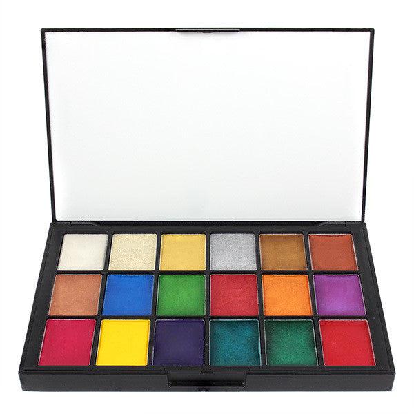
Viseart's Editorial Brights Matte Palette contains 12 bright, rainbow matte shades of highly micronized pigments created for a smooth and even application. This highly pigmented bright palette is ideal for electrifying editorial looks with this kit staple!
Shades Include
White is a bright white with a matte finish.
Lime is a neon yellow green with a matte finish.
Kelly is a bright green with a matte finish.
Aqua is a bright aqua with a matte finish.
Pink is a bright fuchsia pink with a matte finish.
Orange is a primary orange with a matte finish.
Yellow is a primary yellow with a matte finish.
Periwinkle is a cyan blue with a matte finish.
Red is a neon red with a matte finish.
Raspberry is a bright raspberry with a matte finish.
Grape is a bright magenta purple with a matte finish.
Azure is a cerulean blue with a matte finish.
Size: 24g
Modo de uso
White
This can be mixed with any of the other colors to make pastels, or blended in as a matte opaque color.
Lime
Mix this yellow-green with white to make pale lime, or with Clover to intensify the depth of the green. This color is also analogous to both blues and yellows.
Kelly
Mix this green with white to make pale green, with yellow to make a lighter green, or with blue to make Teal.
Aqua
Mix this blue-green with white to make anything from pastel teal to turquoise.
Pink
Mix this tertiary tone with white to make anything from pastel to bubble gum pink, or use to brighten up blue and green eyes. This can also be used on cheeks or mixed with a blush that’s too light to intensify the pigment.
Orange
Mix orange with white to make anything from a pale orange to pastel. Orange is amazing against blue eyes and can be used with analogous colors like Red and Yellow.
Yellow
Mix this versatile, primary yellow with white to make anything from pastel to buttercup! You can also blend with orange to intensify the yellow or blend with red to change the depth of the orange.
Periwinkle
Mix this tertiary color with white to create a range from pastel to sky blue, or use with analogous colors like purples or greens.
Red
Mix this primary color with white to make multiple shades of pink, or blend out to create purples, browns, oranges and more.
Raspberry
This tertiary, red-violet is fantastic against brown or hazel eyes to brighten and is a super versatile color with almost every eye shade.
Grape
This secondary color can be made into pastel simply by mixing with white. This is also super versatile for intensifying any eye color.
Azure
Mix this primary blue with white to make a pastel blue, or use dramatically for anything you can think of. This can be used for liner, lid, crease is a the sky's the limit. Blue is also a wonderful color to brighten Brown and Hazel eyes.
Ingredientes e información sobre alergias
Shade 1 (White): Talc, Mica, Octyldodecyl Stearoyl Stearate, Octyldodecanol, Zinc Stearate, Octyldodecanol, Potassium Sorbate, Sodium Benzoate. Shades 2 (Lime), 3 (Clover), 4 (Aqua), 5 (Pink), 6 (Orange), 7 (Yellow), 8 (Periwinkle), 9 (Red), 10 (Raspberry), 11 (Grape), 12 (Azure): Talc, Mica, Octyldodecyl Stearoyl Stearate, Zinc Stearate, Octyldodecanol, Potassium Sorbate, Sodium Benzoate. (+/- may contain: Yellow 5 CI 19140, Titanium Dioxide CI 77891, Blue 1 CI 42090, Red 28 Cl 45410, Red 6 Lake CI 15850, Red 7 Calcium Lake CI 15850, Ferric Ferrocyanide CI 77510, Red 40 CI 16035, Iron Oxides CI 77492/CI 77499). Vegan. *WARNING* - Shades 5, 6, 9, 10, 11 contain pigments that the FDA has determined are unsafe for use in the eye area.
Haz una prueba en la piel antes del primer uso, sobre todo en piel sensible.
Enviamos el mismo día hábil
Pide antes de las 2 PM ET y sale el mismo día.
Reembolsos en 30 días
Te devolvemos tu dinero, no crédito de tienda. No hay cargo por reposición.
Paquetes perdidos reemplazados
Si no llega, lo enviamos de nuevo.
Distribuidor autorizado
Revisamos las fechas de caducidad en cada pedido. De mayo a septiembre, los productos sensibles al calor se envían en empaque aislante.
Lo que dice la gente
Sé el primero en reseñar este producto